Latest
Why retailers must adopt a mobile-first strategy across all digital marketing channels
Over half of internet usage today is generated through a mobile device. It has become an expectation that people will have access to any information at any time, even on the go. This trend has grown substantially in recent years and is projected to continue, growing by a staggering 188% in the next four years.
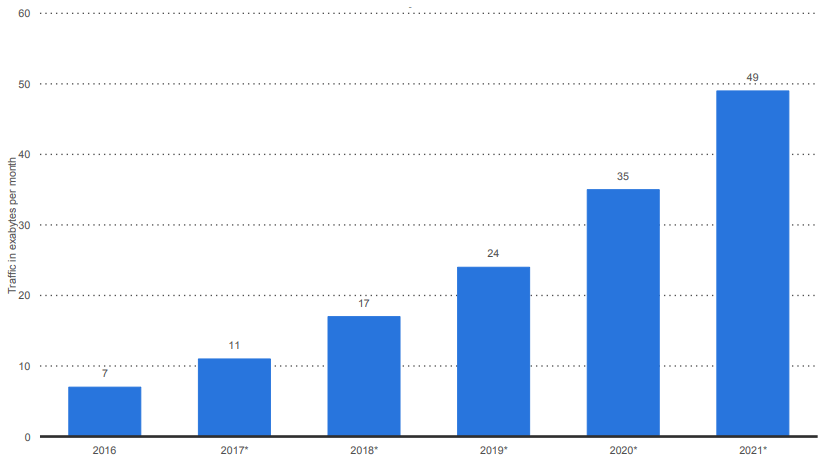
– Global mobile data traffic from 2016 to 2021 (in exabytes per month) – Source: Statista –
Since over half of customers now sit in a different marketplace, PPC managers must realign their budgets, leading to mobile being more competitive than ever through paid media. This is illustrated below, with paid advertising on mobile more than doubling between 2015 and 2017 and projected to increase even further in the future.
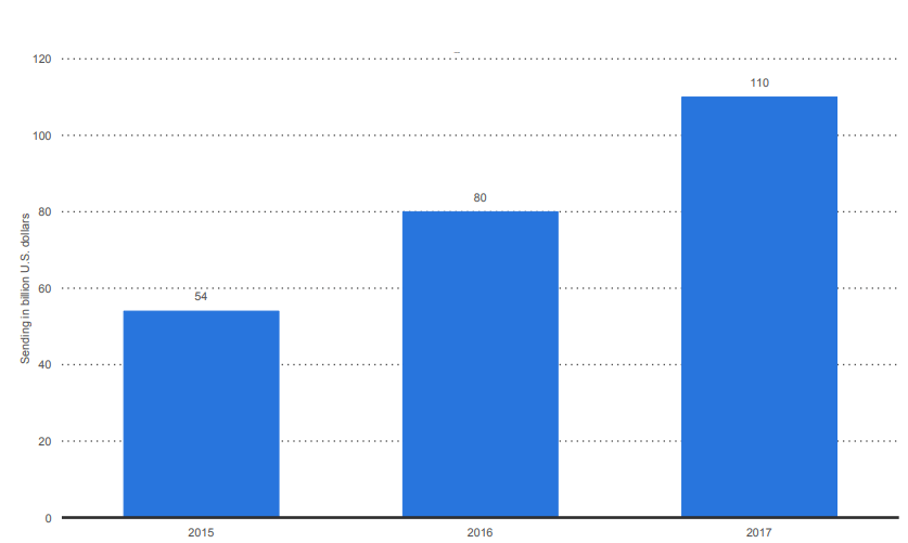
– Mobile advertising spending worldwide from 2015 to 2017 (in billion U.S. dollars) – Source: Statista –
As retailers shift their paid media budgets to focus on their mobile audience, so too must they prepare for the mobile-first indexing shift in natural search.
What is mobile-first indexing?
The SEO community has been discussing Google’s shift to mobile-first indexing for well over two years now, but as of the 26th of March 2018, Google has confirmed it’s officially underway. With the first batch of mobile-first notifications being sent out in April, brands should keep a close eye on their Google Search Console notifications as it is likely to come through any day now if it hasn’t already. An example of what the notification will look like in Search Console can be seen below.
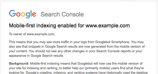
– Mobile-first indexing notification. Source: Search Console –
Historically, Google bots have used the desktop version of a webpage to index and rank it in search engine results pages (SERPs). The move to mobile-first indexing means that Google will instead focus on the mobile version, and use this as the basis for ranking the page both on mobile and desktop.
Even if 90% of your visits are acquired through desktop, your site will still be ranked on a mobile-first basis. However, if no mobile version exists, it will continue to use the desktop version for rankings.
Why has Google chosen to move to mobile-first indexing?
The people at Google are, surprisingly enough, quite into their trends and data. They constantly evaluate how searchers use their service to determine which attributes should be rewarded most generously within their algorithm.
The reason for this shift to mobile-first can be summed up most effectively by the StatCounter trend data shown below. When looking at search on a worldwide scale, most searches are now performed on a mobile device, so it makes sense to reward strong mobile sites and shape search engines around how users now browse the internet. This change means that webmasters will focus more on mobile optimisation, ensuring a better mobile experience for everyone.
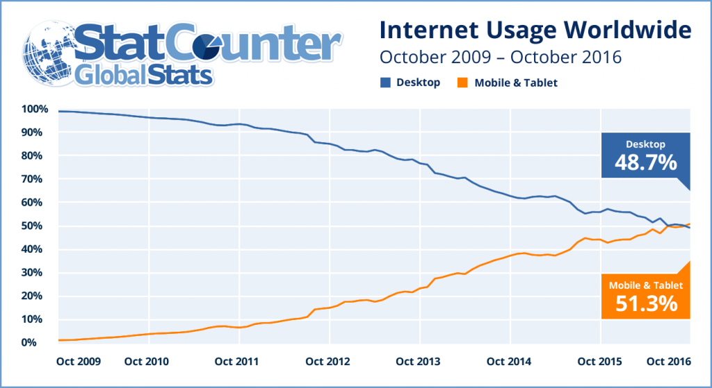
– Internet usage worldwide trends. Source: StatCounter –
This is currently a Google-only approach, so your other search engine traffic is likely to be unaffected by the change. Although, following Google’s example, this could change in the near future.
Mobile site speed is more important than ever
Although page speed is already a ranking factor, it is currently restricted to just desktop performance. As of the 1st of July 2018, mobile speed will be incorporated into the Google ranking algorithm.
With users’ expectations of mobile performance continuing to rise, there is more pressure on retailers to overcome the constraints of the platform. Constraints appear from many different aspects, whether it is the screen real estate or the slow and sometimes inconsistent connection types.
This means that as marketers we need to prioritise what content is being shown to the customer and evaluate what is needed to help the user finish their conversion journey. If a feature isn’t enriching the customer’s experience, we should explore the possibility of removing it entirely to avoid slowing the page down.
This may seem like a daunting task; however, you can rejoice, it isn’t nearly as scary as it first appears. The quickest win that most brands can make to save space on their mobile pages is to simply compress images and text.
Additionally, you could also check to see what JavaScript and CSS is used on each template, and if some are not being used, strip them out. These two tips are likely to help massively, so get in there and start investigating.
How fast is fast enough?
“You need your page to weigh less than 1Mb to display in 5 seconds on a first view on fast 3G”. This was stated at a Google conference specifically surrounding mobile optimisation which I attended earlier this year. There is still some debate around this, however, I believe this is what we should be aiming for as a rule of thumb.
One metric that we have been told to keep our eyes on is the ‘time to first paint’; in other words, how long it takes for the user to know what is going on with the page.
‘Skeleton screens’ can help reduce the time to first paint. This involves breaking a page down into its basic shapes before it loads, giving the user greater insight into what is about to be delivered to them. To see this feature in action, look no further than your own Facebook, Instagram or Twitter apps:

– Facebook skeleton load page –
How will the mobile-first shift affect quality score?
This change may affect your paid accounts and media spend a lot more than you think. Keep an eye on your quality score following these changes, since Google will be keeping close watch too.
User experience is a large component of quality score, and as such, a slow loading website is not going to serve a memorable experience for your customers. When this happens, not only do you miss out on sales, but you may also end up paying a premium for your ad placements.
From an organic search perspective, your category and product lister pages, in particular, should be fast (as these usually rank within SERPs). However, paid teams will see the greatest impact from improving product page performance.
Check your landing page speed regularly to ensure that customer experiences remain consistent; keeping it fast will reduce bounce rate and increase conversions. An example of a mobile site test can be seen below:
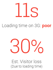
– Page speed scorecard. Source: Google –
Mobile speed has a real impact on bounce rate; can you really afford a potential 30% drop in traffic simply due to a slow loading site?
Addressing this leads to happy customers who will return, happy Google which is providing a useful service to users and an even happier PPC manager as budgets, efficiency and quality score improve.
Mobile performance is an industry-wide challenge
Using our own Summit Scorecard, which ranks the performance of the top 50 UK retailers against elements from all components of the online retail value chain, I looked specifically a mobile performance scores.
To measure this, I used the Google Lighthouse tool to give an accurate overview of how each of these brands performed across the 4 areas that the tool looks at: performance (speed), accessibility, best practice and SEO.
The results showed that accessibility and best practice are where there is the greatest variance between the brands. Accessibility scores ranged from 25% (Very.co.uk) to 91% (Matalan) and best practice spread from 44% (TK Maxx) to 88% (Apple).
However, performance is the area where most of the top 50 brands are missing a trick. With an average score of 32%, this is clearly an industry-wide issue that needs to be tackled and with mobile speed being so important come July 1st, the time is now.
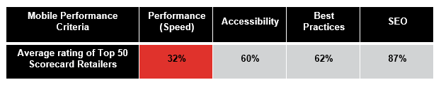
Some of the notable brands who performed poorly for mobile performance are New Look (19%), JD Sports (7%) and House of Fraser (7%).
Brands that have come out ahead in terms of mobile performance are Littlewoods (64%) and Superdrug (62%). However, there is still work to be done to improve scores further when it comes to mobile speed.
Mobile has evolved; now it’s your turn
The good news is that you still have time to get your site ready for the mobile speed algorithm update.
I suggest you use some of the tips highlighted in this post and follow the steps below to make sure you’re ready for July 1st:
- Audit your site using some of the highlighted tools such as Lighthouse and TestMySite
- Identify problem areas, for example, image compression and optimisation
- Follow Google’s specified guidelines for implementing these efficiencies
- Retest, ensuring that these changes have been implemented to best practice standard
As mobile-first is already here, to get ahead of the competition and avoid any commercial impact, you should look to prioritise mobile optimisation across your paid and natural search marketing plans as soon as possible.
For further guidance to ensure you are prepared for a mobile-first landscape, please contact John Readman; we would love to hear from you.
Sources
http://gs.statcounter.com/press/mobile-and-tablet-internet-usage-exceeds-desktop-for-first-time-worldwide
https://searchengineland.com/google-begins-rolling-out-mobile-first-indexing-to-more-sites-295095
https://www.statista.com/study/21391/mobile-internet-usage-statista-dossier/
https://www.statista.com/study/24805/mobile-search-statista-dossier/
https://testmysite.withgoogle.com/
https://www.thinkwithgoogle.com/intl/en-gb/feature/mobile/?country=United%20Kingdom
https://webmasters.googleblog.com/2018/01/using-page-speed-in-mobile-search.html
Ready for change? Let's talk
Speak to Summit